Why do some ads get more clicks than others? There are millions of articles out there with tips on how to get more clicks and conversions.
But often, it comes down to one simple element:
The call to action (CTA)
If you don’t have a call to action, or you have one but it’s not clear or compelling, your online ad will never give you the results you want.
What is a CTA?
Your CTA is the part of a digital marketing campaign that compels your audience to take action immediately.
It is a simple request (or command) for your audience to take the next step to find out about a product or service, or even buy now.
Examples of calls to action (CTAs) include:
- Buy now
- Sign up for your free trial
- Enrol today
- Download your free ebook
You should use CTAs in social media posts, email campaigns, webpages, eCommerce pages, landing pages, and more.
Why is a call to action important?
The reason you need to master the CTA is simple: you’ve worked so hard to create your ad or social post copy, chosen your creative and images, and targeted it so precisely to the right audience, a CTA gives you the final push for the all-important conversion.
Think about it – when it comes to online marketing, you don’t have a lot of time to grab the user’s attention. So, it’s essential to have a clear call to action that tells them exactly what they should do, and why it’s worth their click.
LEARN HOW TO USE CTAs AS PART OF A HIGH-CONVERTING SOCIAL MEDIA STRATEGY
How to craft an irresistible CTA
In order to understand the anatomy of a winning call to action, take a look at these examples:
CTA Example 1: Xero
The best thing about the call to action on Xero’s website homepage is that it stands out immediately. It’s in a different colour to the rest of the page. It’s bold and eye-catching. The wording is also compelling, giving users a good reason to click through.
Notice how they also have a secondary CTA? People who want to learn more before signing up can click on the more subtle button.
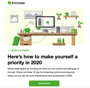
CTA Example 2: Evernote
This email by Evernote uses popular wording to get maximum click-throughs: “Show me how”. It’s much more effective than “Click here” for the simple reason that it uses the first person, which is more personal, and tells the user what they can expect when they click through.
CTA Example 3: Marketo
Unsurprisingly, marketing software Marketo knows how to craft a winning CTA. Notice the powerful language accentuated by the upper-case text. Also, the buttons stand out in purple with effective repetition throughout the webpage to make sure you request that demo.
Now you’ve seen some examples, how do you write an effective CTA?
Start with these essential tips:
- Keep it short
You don’t have long to capture your customer’s attention, so make sure you get to the point quickly. A short sentence or a couple of words is all you need.
- Stick to one message
Don’t mix your message or over-complicate your call to action. Rather than “Sign up here and claim your free sample”, use “Claim your free sample”.
- Think about what the customer will care about
What do your customers want? What are their pain points? Use your knowledge of buyer personas to craft a hyper-targeted CTA that hits the mark.
- Tell them what they get in return
Promise an immediate benefit for the customer. For example, getting free trial or demo, unlocking access to a free expert resource, or talking to you for more information.
- Consider what you want to achieve
Do you want customers to download an eBook to learn more about your product? Or subscribe to a daily newsletter? Share your posts on social? Or buy something? Use your CTA to achieve your marketing goals.
- Don’t crowd your content with CTAs
How many CTAs should you use? That depends. You really only want one or two calls to action per piece of content or web page, so you aren’t overwhelming the visitor and being too pushy.
It’s good to use a CTA in the middle of your webpage or content to drive action. This is proven to work because people only read 60% of your article before clicking out, according to Hubspot. So, of you want to win a conversion, you should try and catch them before the final 40% of content.
- Test, test and test again
Use A/B testing to see what CTA works best. A/B testing is where you trial almost identical versions of your digital ad (for example) but only change one thing – in this case, the CTA. Test different colours, words and positions.
Final Word
CTAs are a powerful tool for digital marketing. Get them right and you can propel your clicks and conversions. Remember, concise language and testing are key. Take some time to understand what you want to achieve and who you want to attract – this is how you will craft CTAs that are truly click-worthy.
CTAs are an essential tool for any high-converting social media marketing strategy. In this online course, we break down the elements of a winning social media marketing strategy so you can hit the ground running and start getting the results you want.


